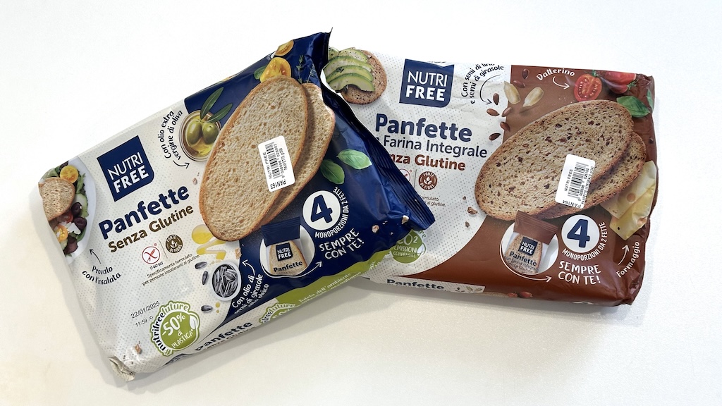
Today my wife challenged me with 2 versions of a packaging that showed a brand color with -she said- visible differences: “But is this difference tolerable?” she asked.
I must say that her color vision is probably not normal: she can often spot a difference when a normal human being would not see anything.
So, I took the 2 packages and went to the window to check them under a better light from the sunny morning. Yes, they are different, but not that much… it must be less than 3 dE.
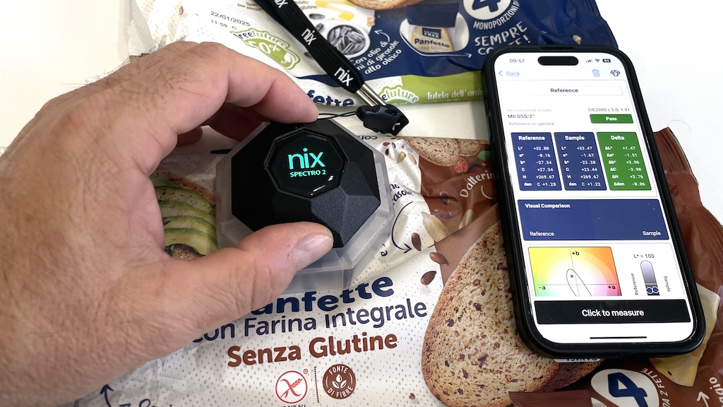
“And is this normal?” she continued. I think so, but let me do some measurements…
The difference between the 2 blues is in fact dE 1.91 and the closest Pantone reference -for both- was 2140C, and they were matching the reference with 2.70 and 2.76 dE. Obviously I don’t know if 2140C was the correct color to match: I can only say that, from the digital library, it was the closest color for both printed samples.
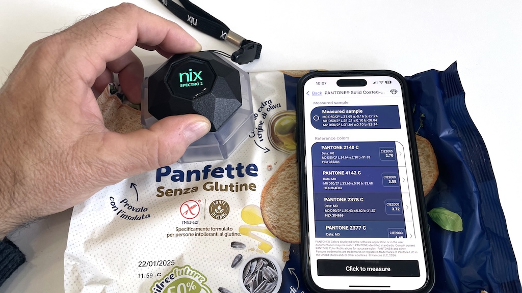
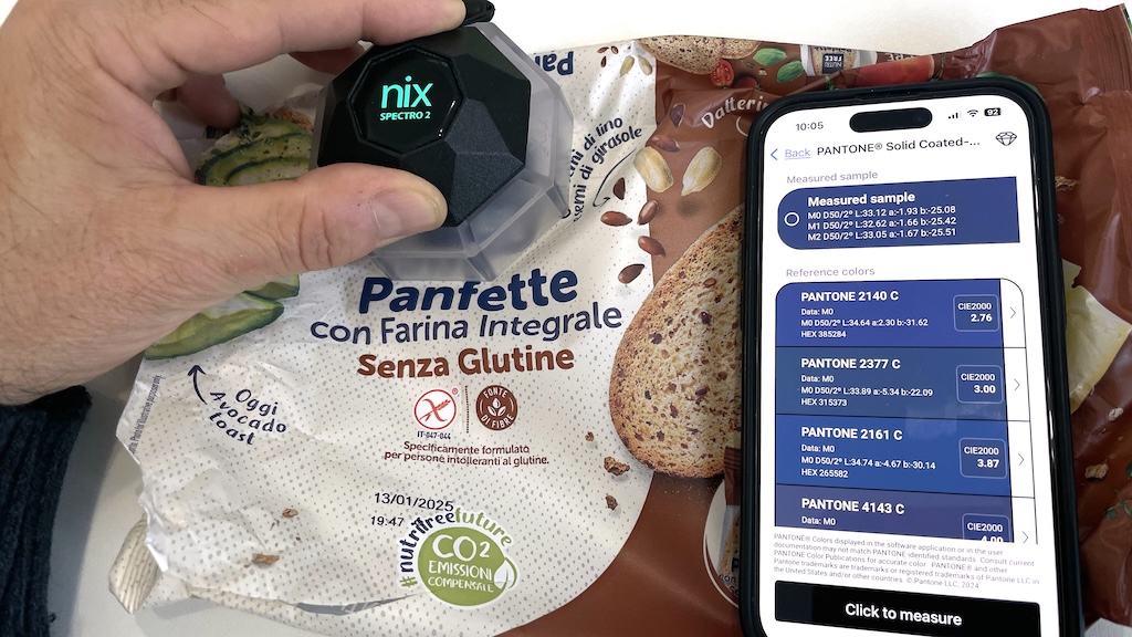
So, at first glance, the products are good and colors are matching. Perfect! 👍
Now the question is: could they be better?
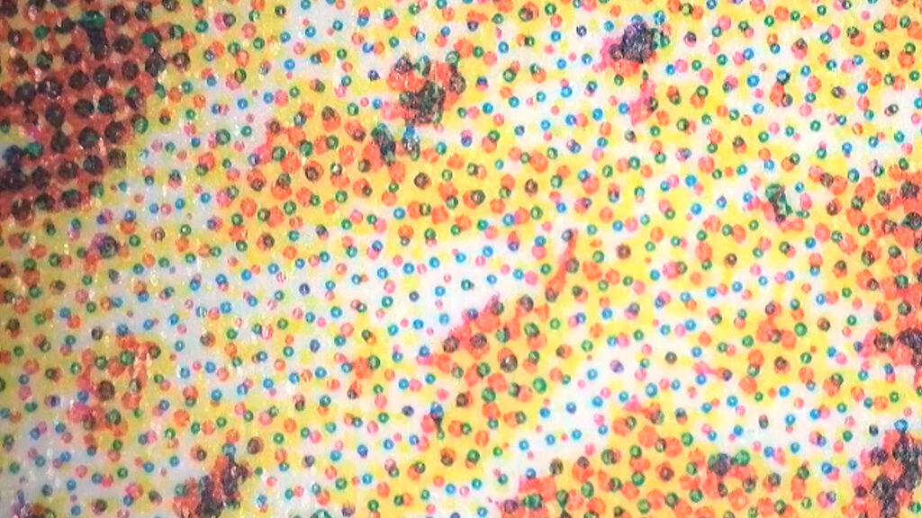
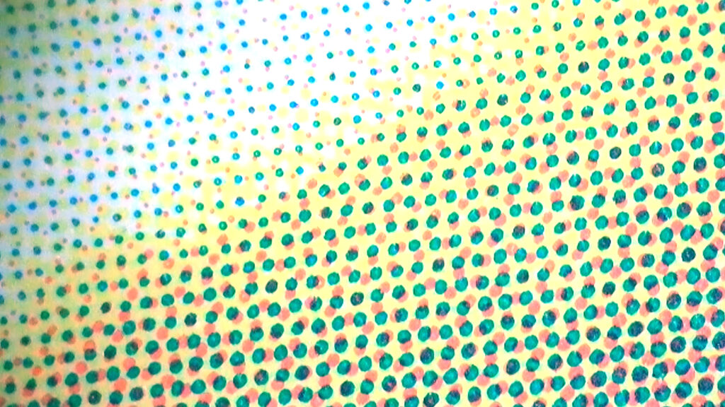
When I checked a little more closer, I could see that the dark blue is actually a result of 2 overprinting inks: one solid (special blue color) and a certain percentage of Cyan dots. If the choice to print with a separate blue ink was to enable color adjustments on press without interfering with the CMYK separations, then the additional Cyan makes it a bit more difficult to predict the resulting color. In flexography, defects in the laydown of solids are unfortunately always around the corner, so it is worth printing that blue directly in four-color process because it nicely falls inside the CMYK color gamut.
A similar thing also happens with the brown of the “Farina Integrale” version which sometimes prints alone and sometimes is supported by Magenta, resulting in slightly different browns. It’s not a big deal, but a standard CMYK print here would have been fine.
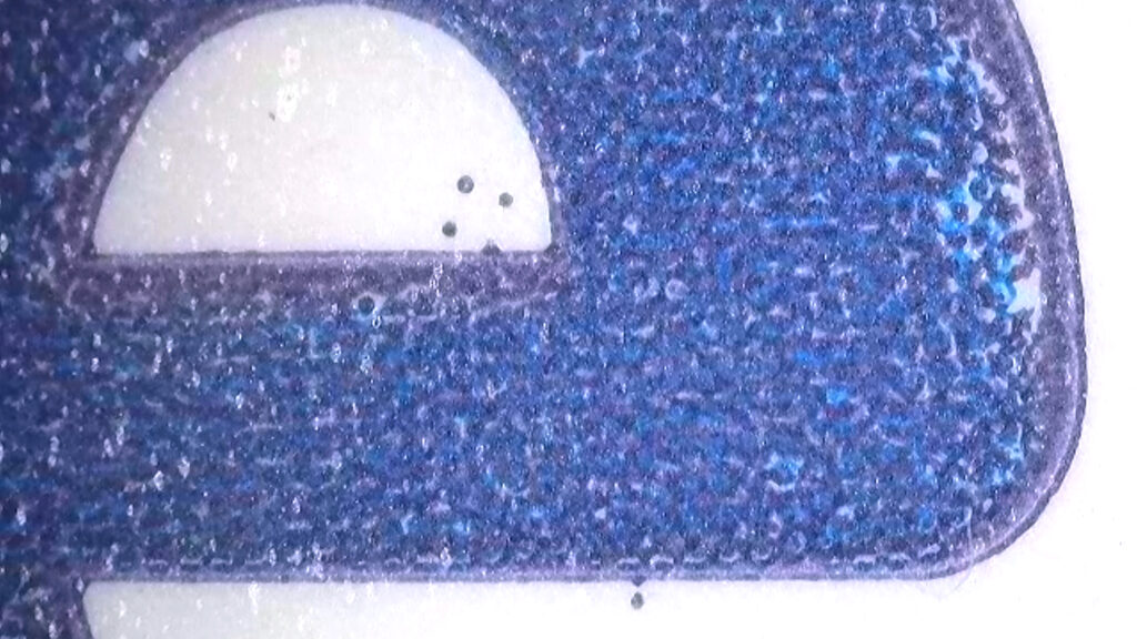
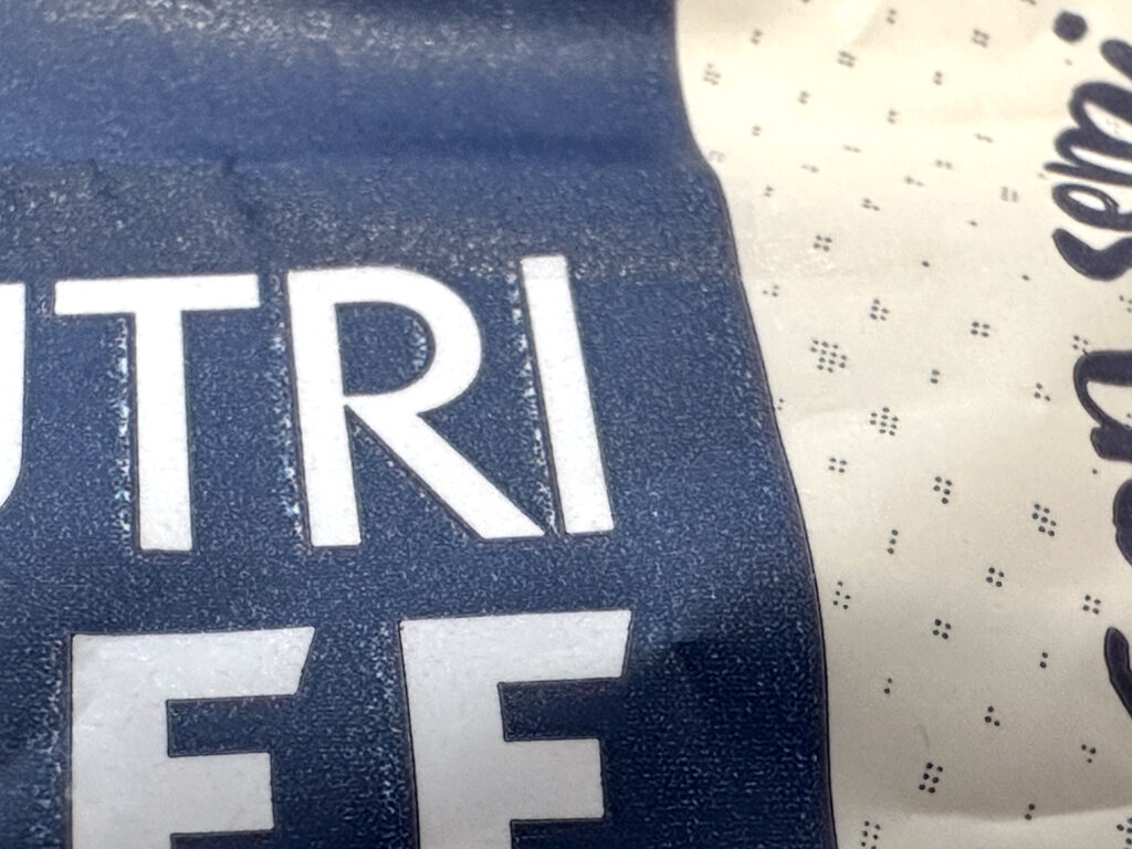
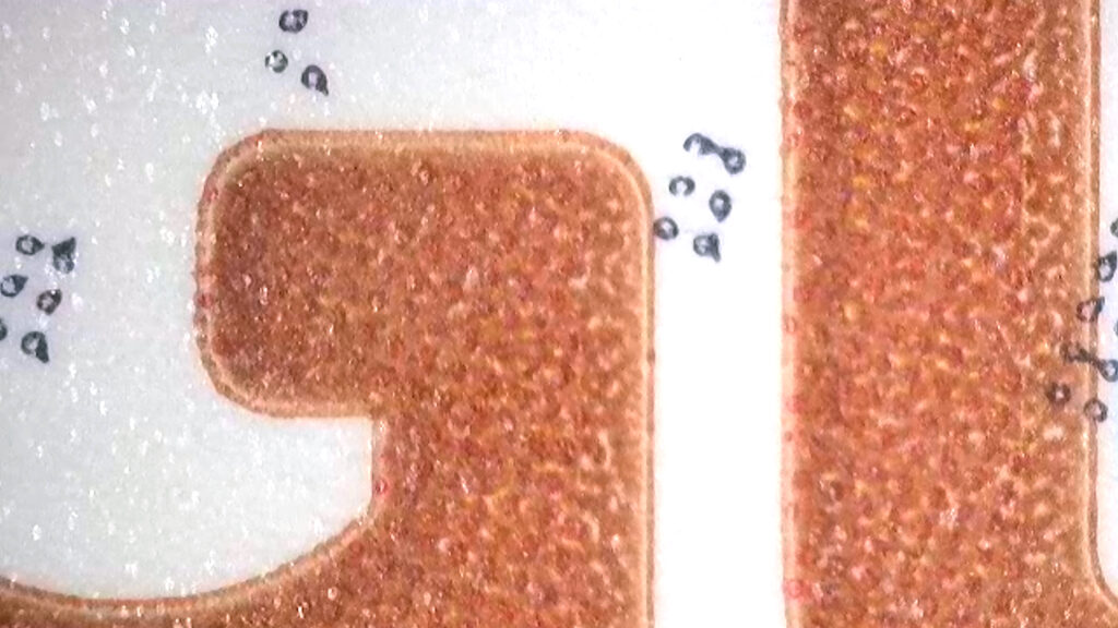
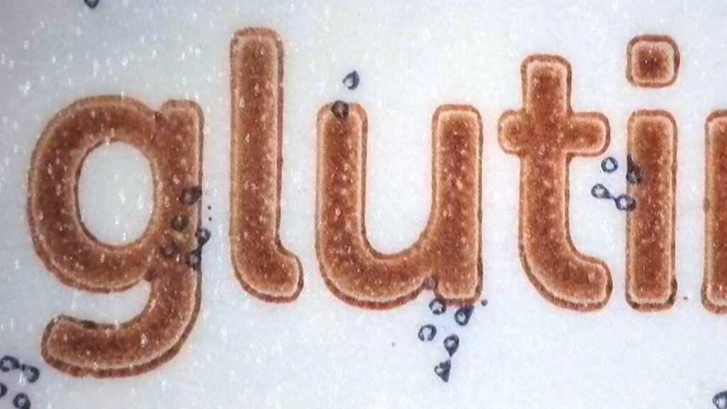
The dark blue is not actually used only for large areas but also for tiny highlight dots and text. But here something happens: due to the higher ink volume, the press operator probably had to play a bit with print impressions and the reproduction is not very clean, with noticeable differences between the 2 versions.
The light cream background was also printed with a large solid of a special dedicated ink. It could have been printed with 1 or 2 CMYK separation channels without any complications.
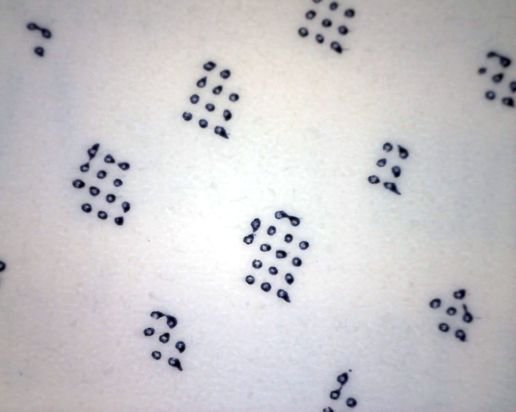
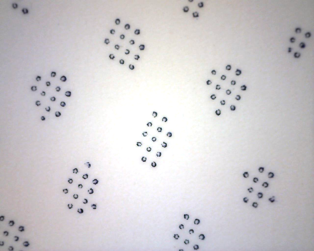
Probably the extra special colors (blue, brown, cream) were added in order to allow eventual adjustments on press without compromising with the colors of other graphic elements like CMYK separations in the layout.
Maybe, to adjust the dark blue, the printer changes the Cyan, or for the brown he touches the Magenta and it is feared that adjusting these colors will change the color of the bread or the vegetables. But why? There should be no Cyan in a subject like the slice of bread, and not even Magenta in the greens!
A quick look at the images shows a rather high amount of Cyan in the bread and Magenta in the greens. These are opposing colors in the separation and any possible variation due to the instability of the printing system, or even normal adjustments, would desaturate the resulting color.
But then were the extra special colors added only because the color profiles used for the separations are not suitable for problem-free reproduction?
Perhaps it would have made sense to proceed with a correct re-calibration of the printing system to make the most of CMYK reproduction.
Every time you plan for a separate special ink to reproduce any color just because “so it’s easier to adjust it on press”, always remember that you are adding time and producton costs for extra prepress work, extra plates, extra ink, extra energy for drying, extra washouts and solvents, extra press setup and makeready, extra controls and adjustments, extra waste.
“Eh, but that little text in blue…” I am convinced that faced with the advantages of a fixed-palette CMYK production, any brand will be happy to consider printing the text on the back of the packaging in black from CMYK rather than in a different special color.
As you can see, the quality of the final product is the result of the collaboration between the printer and converter, the prepress provider, the graphic design agency and the brand, final customer. Today all this must be managed with great attention to the environmental impact of the entire production process: it is a commitment that the entire supply chain must take on to guarantee a sustainable future for our packaging products. My mission is to help users in achieving a consistent, repeatable and predictable process by understanding the characteristics and the interactions of the components and the variables that contribute to quality within the flexographic printing system.
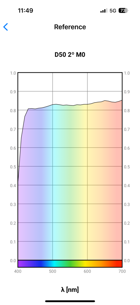
PS1: I used M0 condition because I normally check printing conditions based on characterization data measured in M0 and because I first checked on a white unprinted area and I didn’t notice any possible presence of OBAs.
PS2: My wife says that she will purchase again the products regardless of print quality, provided she can recognize them on the shelf.
